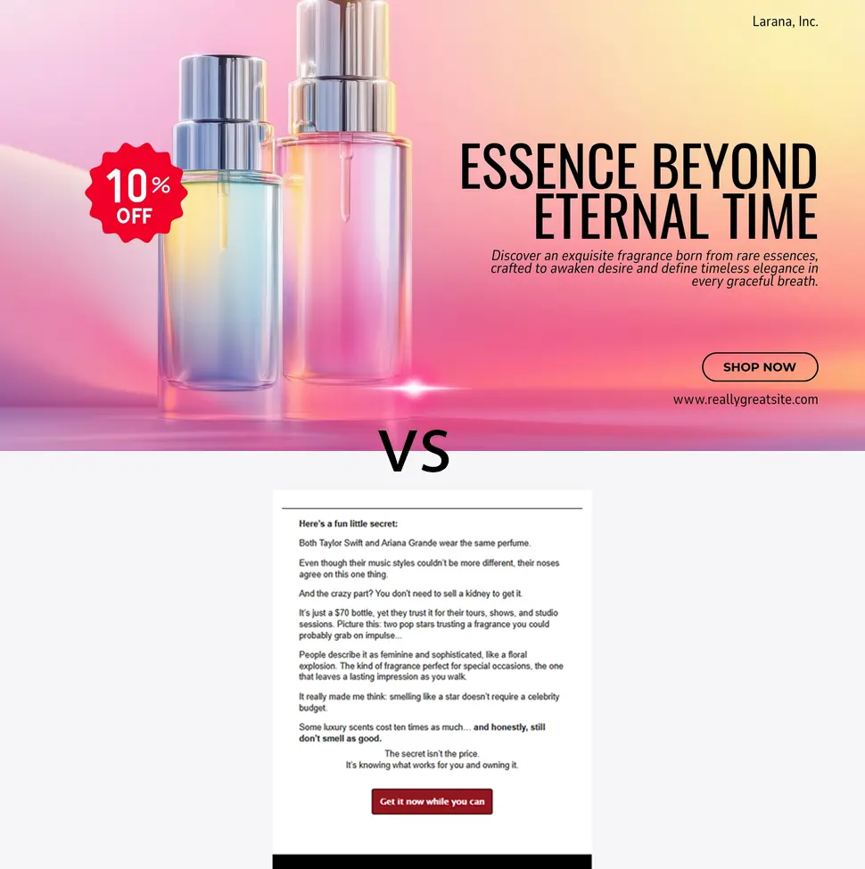
I run into the same issue with business owners. especially in eCommerce. They’re obsessed with product photos every single time.
They treat it like gospel. Like an unspoken rule. God forbid you ever send an email without images. Do that, and apparently your mortal soul gets condemned for all eternity.
None of that is true.
Here’s the uncomfortable reality: intentionally ugly websites can make you loads of cash and save a fortune on graphic design while you’re at it.
Ugly beats pretty every single time.
Email works the same way.
Take a guess: which email converted better?

In my tests, the minimalist version crushed the saturated, image-heavy one by a mouth-watering 40% percent. That’s some pocket change!
Most businesses emails hide behind pretty pictures. It lets them avoid facing the truth that their copy is weak, their offer is mediocre, and their list don’t really care.
Design becomes a shield. A distraction. A convenient excuse to keep barely writing any copy while pretending they’re being productive…
What’s even worse, they commit the deadliest marketing sin, they are boring.
Heavy images scream corporate. When your email looks like a billboard, people categorize it as advertising. Advertising goes straight to the trash.
It takes away any connection to your readers and their credit cards ends up somewhere else.
Copy-first emails force people to actually read. And if you can write, they act.
So, the bottom line is:
Graphic designers should definitely stay on their lane and let marketers do the big boy talk.
Learn more about my newsletter services at cesarcovarrubias.com/contact
Cesar
